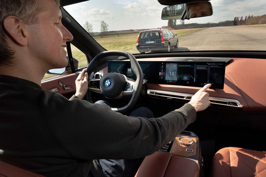
A Swedish car magazine has found a gap in safety when comparing touchscreen buttons to the old-school alternative.
Newer vehicles are seeing touchpads replacing knobs in everything from controlling the radio to the air conditioning.
Tests conducted by Vi Bilägare found that the driver in the worst-performing car needed four times longer to perform simple tasks than in the best-performing car.
“The screens in modern cars keep getting bigger. Design teams at most car manufacturers love to ditch physical buttons and switches, although they are far superior safety-wise,” was the conclusion of the magazine’s testing.
Vi Bilägare tested the HMI system (Human-Machine Interface) of 12 vehicles, trying out changing radio stations to adjusting climate control all while the vehicle was driven at 110 km/h. A 17-year-old Volvo V70 was used for comparison.
The four tests conducted were:
- Activate the heated seat, increase temperature by two degrees, and start the defroster.
- Power on the radio and adjust the station to a specific channel (Sweden’s Program 1).
- Reset the trip computer.
- Lower the instrument lighting to the lowest level and turn off the center display.
Tesla vehicles, for example, have the biggest touchscreens, in which most of the vehicle’s feature controls are housed, even the wipers. The BMW iX also offers a touchscreen, though not as big as Tesla’s, while also providing physical buttons. The research found that even so, that’s no guarantee for easier use.
“The BMW’s infotainment system has lots of features, but it also has one of the most complex and complicated user interfaces ever designed,” Vi Bilägare reported.
It also noted that carmakers like Volkswagen place touch-sensitive climate controls below the screen in the ID.3 to save money. These are not backlit which makes them completely invisible at night.
At the end of the day, the group found one vehicle that stood out from the rest.
“The easiest car to understand and operate, by a large margin, is the 2005 Volvo V70,” Vi Bilägare said. “The four tasks is handled within 10 seconds flat, during which the car is driven 306 meters at 110 km/h.”
To compare against some notable names, the BMW iX took 30.4 seconds, the Volkswagen ID.3 took 25.7 seconds, the Hyundai Ioniq 5 took 26.7 seconds, the Tesla Model 3 took 23.5 and the Subaru Outback took 19.4 seconds.







Leave a Reply